Friday, 26 January 2018

Film Poster


 Film Poster:
I first created this poster which reveals the two main characters of Morgan and his imaginary friend.
Personally, I felt that this poster lacked interest although including various conventions such as the billing block and the tag line. Therefore, I decided to re-create my film poster to make it more interesting and eye catching.


Final Film Poster:

Therefore, I decided to change the image to a key scene in the film trailer which reveals the two characters looking at each other. Additionally, I decided to add a slight glow around the character of the imaginary friend to add interest and make the character more mysterious .
The final poster below reveals the tag line, 'he's here or its all in my head.' This connotes to the audience that the character with the glow is potentially a ghost or imaginary which reflects the psychological genre of the film. Additionally, as a. group we decided to enhance the title of the film and Megan created a larger glow around the phrase 'elude' to reflect how Morgan is alone. Additionally, I decided to change the social media platform to Instagram due to being a popular media form for our youthful target audience.


Film Magazine Process


Step One
Using my sketched designs, I decided to adapt my design to improve the codes and conventions of the magazine cover. Therefore, I decided to improve the masthead to draw attention to the brand as well as make it appear professional to the audience. Additionally, I decided to include the colour scheme of red, white and red into my sell lines to divide each sell line individually. Furthermore, I believe the vibrancy of the text.

Step Two
Secondly, I adapted the masthead and included the a yellow rectangle to assure my colour scheme is constant therefore makes the cover look professional. Additionally, it attracts the audiences attention. 
I also included the pug and the barcode to include key conventions of a magazine. 

Step Three

Next, I included small details such as the issue number, price and social media platforms to create the magazines brand as well as include key information such as the cost. 

Additionally, I placed the splash onto the cover and believe it is eye-catching due to the bold and vibrant text. Furthermore, above I included a yellow box with the phrase 'MOVIEGOER EXCLUSIVE,' reflecting the the audience that the main article is a key feature of the magazine issue.
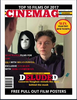
This is the final magazine cover, personally I believe it is conventional and eye catching due to the over the shoulder medium two shot used as the main cover which reveals the relationship between the  two main characters of Deluded. Furthermore, I believe that the colour scheme used is vibrant and eye catching therefore draws the audiences attention to the cover.


Friday, 19 January 2018

British Board of Film Classification


The BBFC is a non-government organisation and is trusted for the national classification and censorship of the UK's films in the cinema, on DVD and other media which needs classification. This is revealed in age ratings which are examines before being released to the public, therefore protecting the public from being exposed to harmful content. If it is believed to be necessary, they are able to cut scenes from films if they feel it is not suitable for the age rating. Additionally, the BBFC provide age ratings and to reach the age rating the examiner will watch the full film and apply the BBFC standards and criteria within their classification. To reach an age rating for a film, examiners watch the full film and apply the BBFC standards and criteria in their Classification Guidelines.
The list below reveals each classification given by the BBFC and the age rating of each.

  • U- Suitable for all
  • PG- Parental Guidance
  • 12A- Cinema release suitable for 12 years and under with adult present 
  • 12- Video release suitable for 12 years and over
  • 15-Suitable only for 15 years and over
  • 18- Suitable for adults
  • R18- Adult works for licensed premises only 


Friday, 12 January 2018

Magazine Cover Drafts


Cover 1:
The first cover I created includes one of the key scenes as the main image due to being interesting and eye catching. The colour scheme is bold and conventional and allows the reader to easily view what is included in the issue.
I decided to use the mast head 'REEL FILM' to reflect the movie reels used at cinemas and to reflect the audiences interest of film.


Design 2:

Personally, I believe that this cover is more conventional
 and interesting due to the bright and eye catching colour scheme as well as the main image. The main image reveals both main characters in our film trailer as well as their relationship. I also used different could text as well as different font to make certain words stand out and catch the readers attention. I decided to use the masthead 'MOVIEGOER' due to the target audience having a large interest in films and likely to attend the cinema often to watch new realises.

Evaluation

Question 1 Film Magazine Film Poster Q1 evaluation 4 poster from NiaWilliams19 Film Trailer Question 2 evaluation ...