 Step One
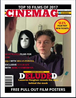
Using my sketched designs, I decided to adapt my design to improve the codes and conventions of the magazine cover. Therefore, I decided to improve the masthead to draw attention to the brand as well as make it appear professional to the audience. Additionally, I decided to include the colour scheme of red, white and red into my sell lines to divide each sell line individually. Furthermore, I believe the vibrancy of the text.
Step Two
Secondly, I adapted the masthead and included the a yellow rectangle to assure my colour scheme is constant therefore makes the cover look professional. Additionally, it attracts the audiences attention.
I also included the pug and the barcode to include key conventions of a magazine.
Step Three
Next, I included small details such as the issue number, price and social media platforms to create the magazines brand as well as include key information such as the cost.
Additionally, I placed the splash onto the cover and believe it is eye-catching due to the bold and vibrant text. Furthermore, above I included a yellow box with the phrase 'MOVIEGOER EXCLUSIVE,' reflecting the the audience that the main article is a key feature of the magazine issue.
This is the final magazine cover, personally I believe it is conventional and eye catching due to the over the shoulder medium two shot used as the main cover which reveals the relationship between the two main characters of Deluded. Furthermore, I believe that the colour scheme used is vibrant and eye catching therefore draws the audiences attention to the cover.


No comments:
Post a Comment